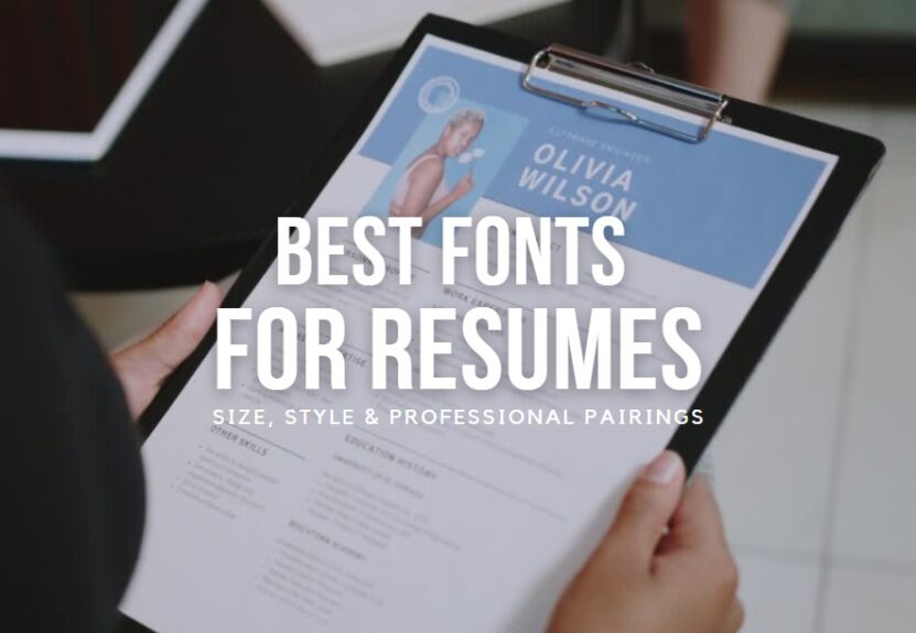
Your resume is more than just a summary of your work history; it’s a representation of who you are as a professional. The font you choose plays a crucial role in creating this representation. It’s not only about aesthetics; it’s about readability, professionalism, and making a great first impression. So, what is the best font for a resume? This comprehensive guide delves into the world of typography to help you make an informed choice.
Why Your Resume Font Matters
Before we explore the options, it’s essential to understand why font choice matters. Here are a few reasons:
- Readability: The hiring manager must be able to read your resume easily. Some fonts improve readability, while others can make it a challenge.
- First Impressions: Like your choice of attire for an interview, your font choice gives off a first impression. It sets the tone for how the hiring manager perceives you.
- Stand Out: In a sea of resumes, the right font can help yours stand out—though remember, standing out for bad font choices isn’t the objective.
- Professionalism: Your font choice can reflect your professionalism. A well-chosen font can subtly signal that you’re a thoughtful, detail-oriented candidate.
Top Resume Fonts You Should Consider
Let’s dive into the top fonts that experts recommend for resumes, along with some of their advantages and disadvantages.
1. Times New Roman
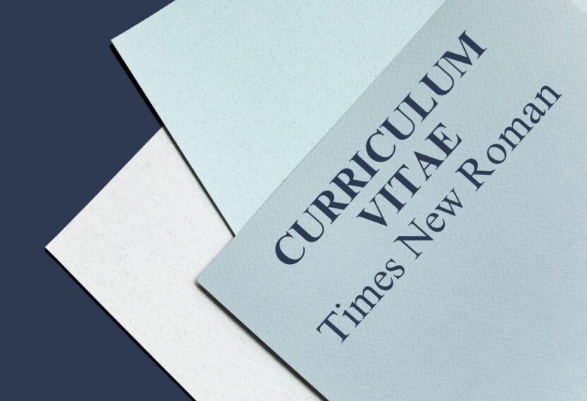
Times New Roman is a classic choice. It’s often the default font in many word processors, meaning it’s universally recognizable and easy to read.
Advantages: It’s traditional, professional, and widely accepted in most industries.
Disadvantages: Its popularity could also be a downside—it might make your resume look generic.
2. Arial
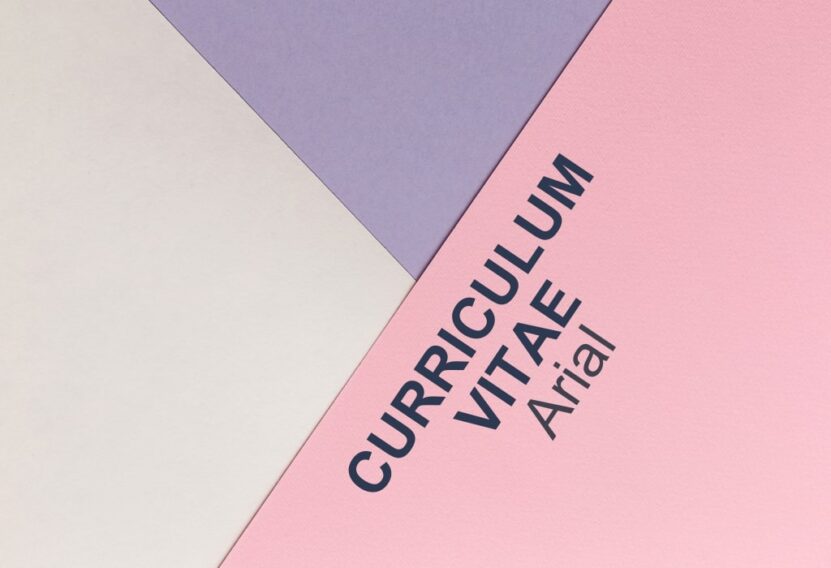
Arial is a sans-serif font that is clean and easy to read. It’s modern and less formal than Times New Roman, making it a good choice for industries that value innovation and forward-thinking.
Advantages: It’s simple, professional, and universally readable.
Disadvantages: Like Times New Roman, its ubiquitous nature might not help your resume stand out.
3. Calibri
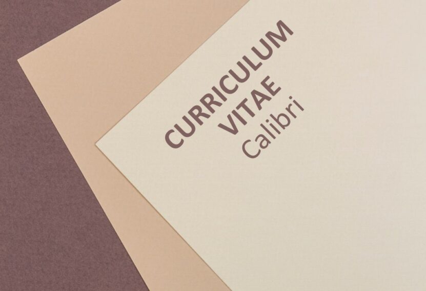
Calibri has been the default font for Microsoft Word since 2007. It’s a sans-serif font that combines a modern look with easy readability.
Advantages: It’s contemporary and clean, and it appears professional on both print and digital mediums.
Disadvantages: Because it’s a default font, many people use it—potentially leading to a lack of distinctiveness.
4. Georgia
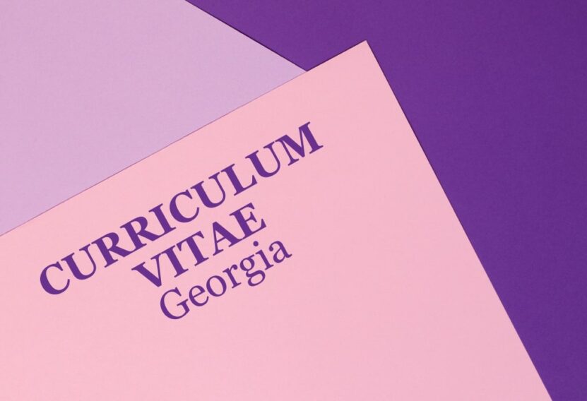
Georgia is a serif font specifically designed to be readable on screens. It has a slightly larger x-height, which makes it stand out compared to other serif fonts.
Advantages: It’s easy to read, particularly on screens, and less commonly used than Times New Roman—helping your resume stand out.
Disadvantages: It’s not as formal as some other options, which may not be suitable for very traditional industries.
5. Helvetica
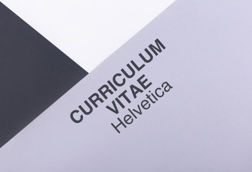
Helvetica is a sans-serif font popular in graphic design and corporate branding. It is clean, modern, and professional.
Advantages: It’s professional, clean, and contemporary, making it an excellent choice for creative industries.
Disadvantages: The font isn’t typically preinstalled on Windows operating systems, which could lead to formatting issues if the hiring manager doesn’t have it installed.
6. Garamond
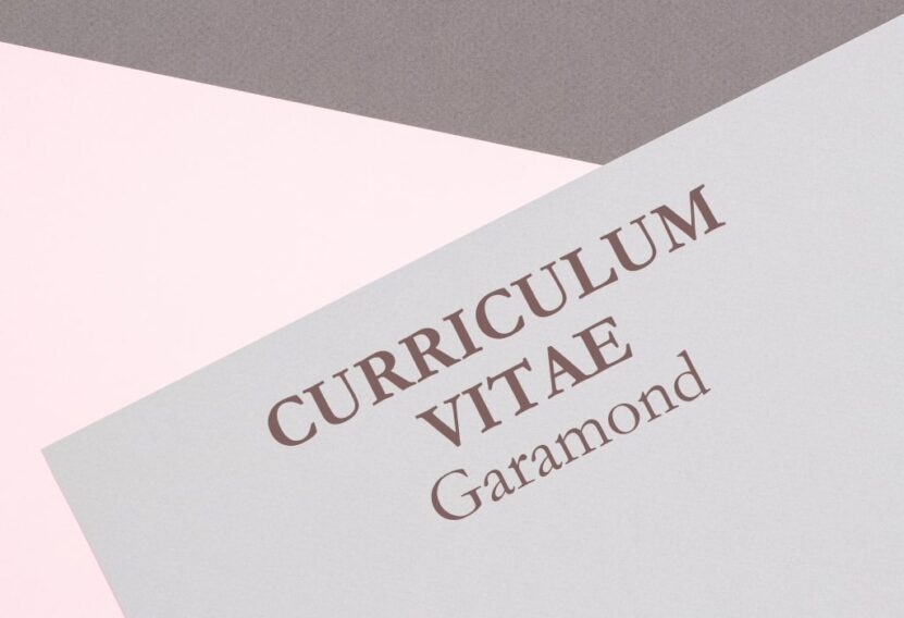
Garamond is an old-style serif font that is professional and easy to read. It’s less commonly used than Times New Roman but is just as classic and respectable.
Advantages: It’s professional, elegant and helps conserve space on your resume if needed.
Disadvantages: The font might be a bit too fancy for some industries.
7. Verdana
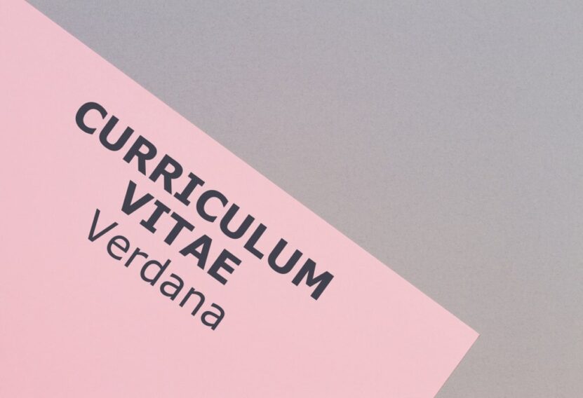
Verdana is a sans-serif font that was specifically designed to be readable at small sizes on a computer screen, making it a good choice for digital resumes.
Advantages: It’s highly legible on screens and in small sizes. It’s clean and professional.
Disadvantages: It can appear too informal for some traditional or ultra-professional industries.
8. Didot
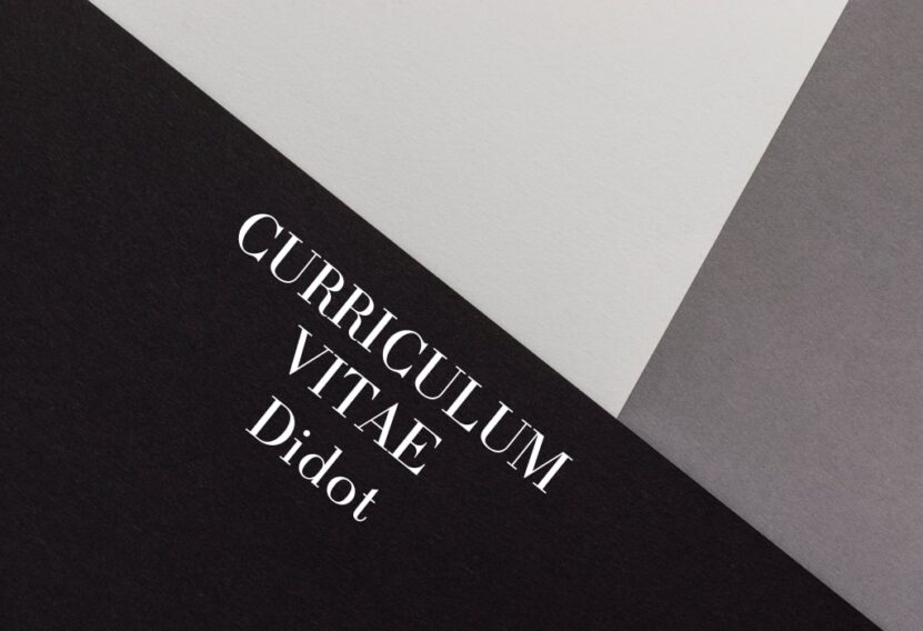
Didot is a serif font with a high level of sophistication and class, making it a popular choice for the fashion and photography industries.
Advantages: It exudes elegance and sophistication, perfect for creative or high-end industries.
Disadvantages: It might not be as readable as other fonts at smaller sizes and may come across as overly stylish in more conservative industries.
9. Trebuchet MS
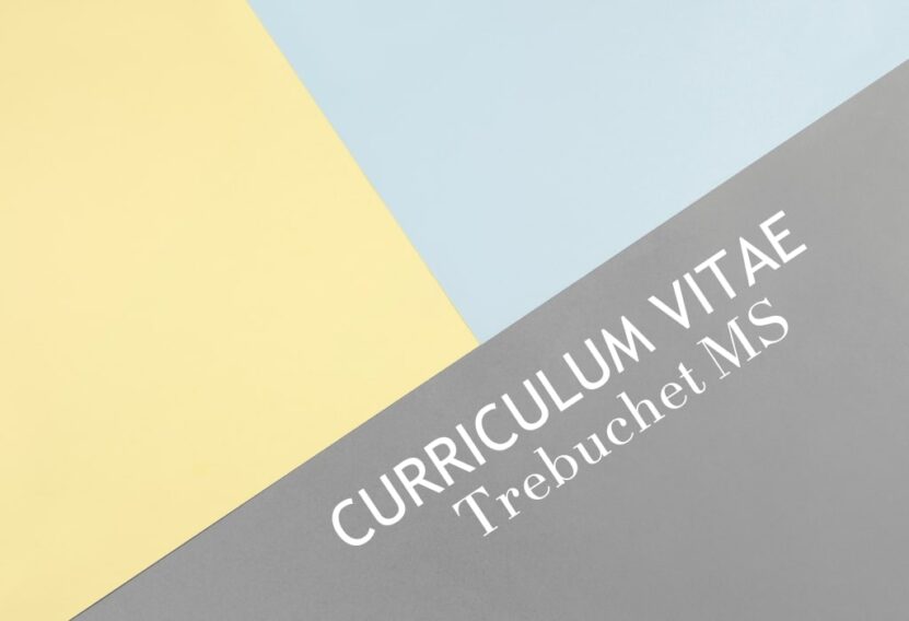
Trebuchet MS is a sans-serif font designed specifically for clarity on a computer screen. Its unique name comes from a medieval catapult, a nod to its designer’s intention to ‘launch’ words at the reader.
Advantages: It’s highly legible on screens, has a modern look, and is less commonly used—giving your resume a unique touch.
Disadvantages: It might be perceived as too modern or informal for certain industries.
10. Lato
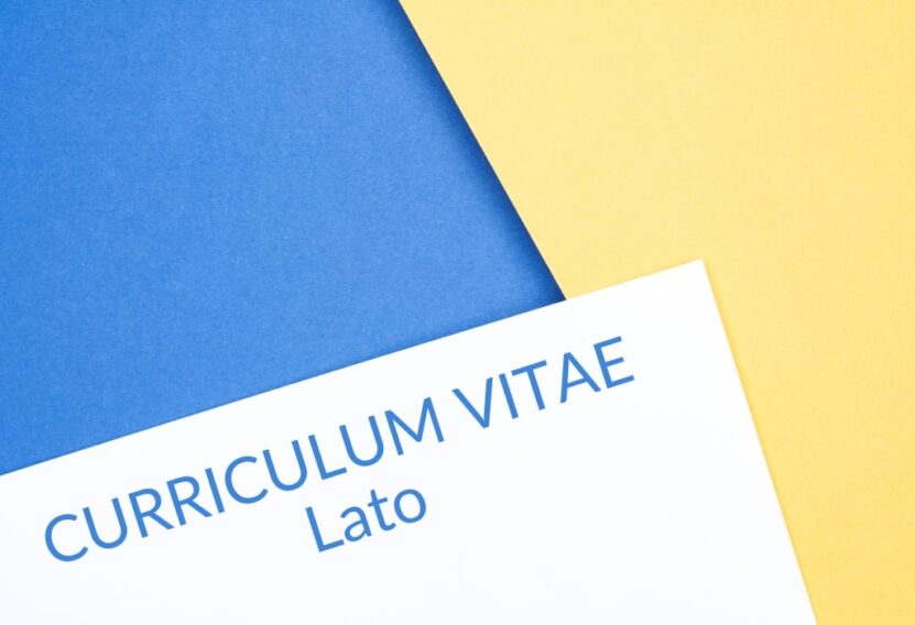
Lato is a sans-serif font that was originally designed for corporate use, so it balances personality and professionalism.
Advantages: It’s friendly yet professional, offering great readability and aesthetics.
Disadvantages: It’s not preinstalled on many word processors, which could lead to formatting issues.
11. Cambria
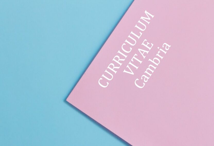
Cambria is a serif font that was designed to be readable on screen and at small sizes, similar to Georgia. It’s a good choice if you want to stick with a traditional look without resorting to Times New Roman.
Advantages: It’s clear and readable, especially on screens.
Disadvantages: Like Calibri, it’s a default font on many word processors, which might make your resume blend in rather than stand out.
12. Gill Sans
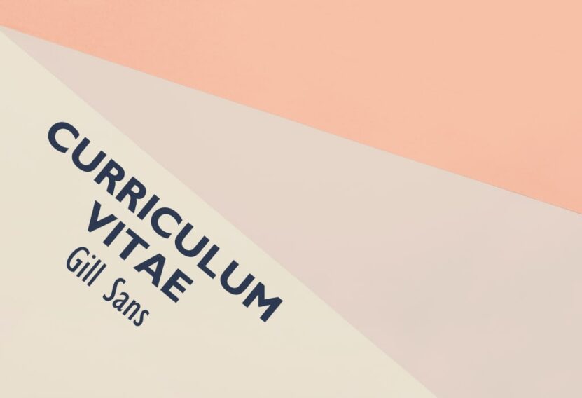
Gill Sans is a sophisticated sans-serif typeface with a warm, friendly look. It’s a great choice if you’re aiming for a modern, friendly, yet professional tone.
Advantages: It’s modern, friendly, and unique.
Disadvantages: Its uniqueness could be a disadvantage in traditional industries.
13. Palatino
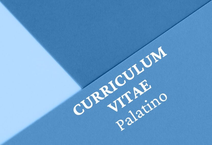
Palatino is an old-style serif font that’s easy to read and gives off an elegant, professional vibe.
Advantages: It’s professional, readable, and less common than fonts like Times New Roman.
Disadvantages: It can appear dated in industries that value modernity.
Font Size and Spacing
Just as important as the font itself is the size and spacing of your text. For the main body, a 10-12 point font is generally recommended for readability. For headings, consider a font size between 14-16 points.
Remember that consistency is key. Use the same font throughout your resume, and ensure your headings, subheadings, and body text are differentiated clearly. As for spacing, ensure your text doesn’t appear too cramped or too spread out.
Avoiding Common Mistakes
When choosing a resume font, it’s also important to avoid common mistakes:
- Avoid Script or Novelty Fonts: Fonts like Comic Sans, Papyrus, or Brush Script are not considered professional for a resume. Stick with traditional, easy-to-read fonts.
- Beware of ATS Systems: Many companies use Applicant Tracking Systems (ATS) to filter through resumes. These systems may not read fancy or unusual fonts correctly, causing your resume to be rejected.
- Consider the Medium: If you’re sending your resume digitally, make sure your font is readable on screen. If it’s printed, it should be clear and crisp on paper.
Final Words
The best font for your resume should reflect your professionalism and industry while also being easy to read on both screen and paper. Avoid novelty fonts and remember that a clear, easy-to-read resume helps hiring managers review your qualifications easily.